A Most Shadowed Descent
Changes to Runes
With only 2 days until the launch of version 3, one would think time would be spent putting final polish or writing up a design analysis.
Nope! I decided to remake the runes in A Most Shadowed Descent.
Previously, I changed the lighting so Runes and Clues stood out more and were easier to locate (as seen below):
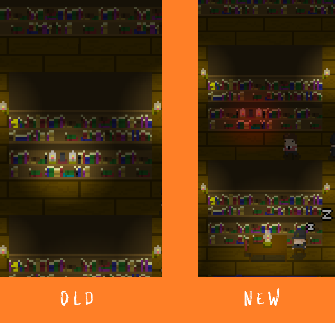
I really liked that change, but found difficulty in telling the runes apart at a glance when casting. I'd been thinking about this for a few weeks and had to question why I liked the newest tutorial rune I had created.
Then it hit me, the runes were too rectangular and the runes for "Voice" and "Expanse" were too similar. So I buckled down, redesigned the stones, and remade the "Voice" symbol.
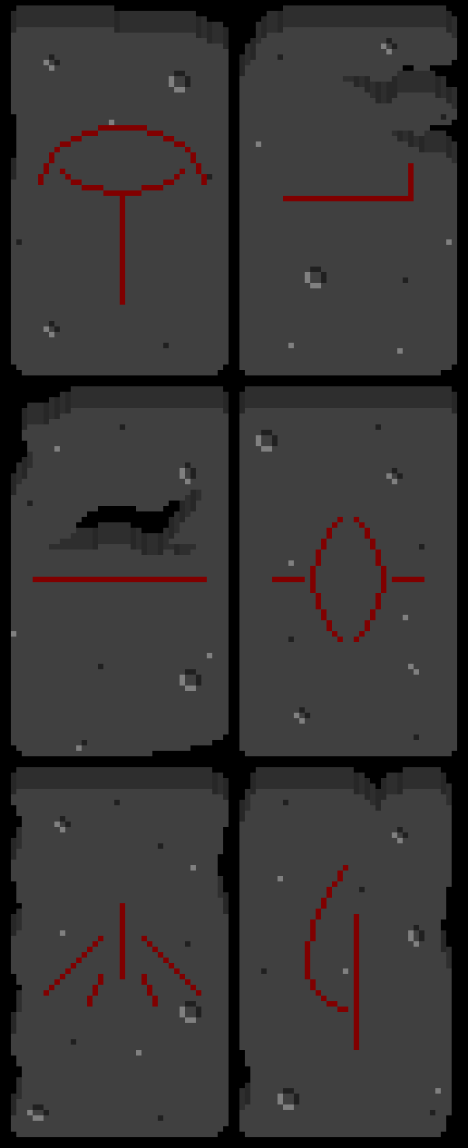
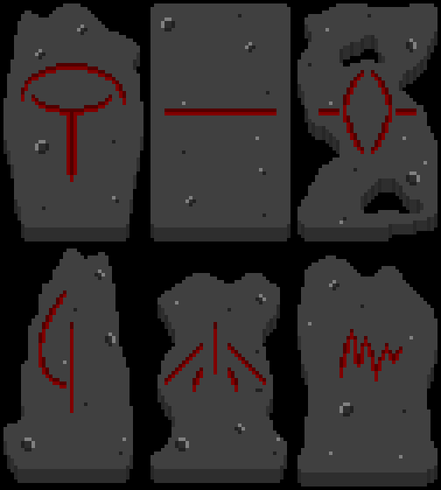
[Left: Old Designs. Right: New Designs (In order: Eye, Expanse, Void, Sorrow, Hand, Voice)]
I like these A LOT more than the previous designs. Each stone stands out more and the "Voice" symbol makes the entire process of managing clues significantly easier.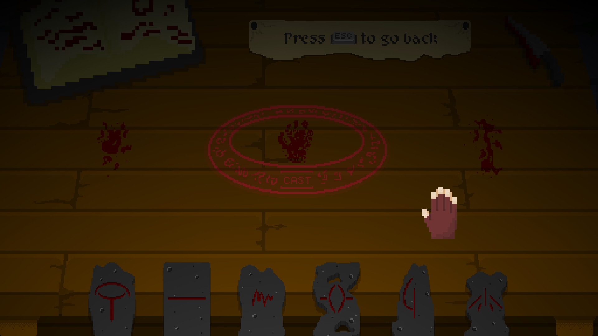
Hopefully you like these as well, I can't wait for the new version to be released October 16th!
Leave a comment
Log in with itch.io to leave a comment.